Visual Branding of your Urban Design Projects. Why Not?
By Amy Ikhayanti.
It is undeniable that urban design projects rely heavily on graphic presentation. In order to communicate the analyses, reasoning and design proposal, the phrase ‘an image can speak a thousand words’ could not be more true. In other words, graphics are crucial in communicating certain aspects of your project that cannot be portrayed otherwise. Finding the hybrid between both a visually insightful and verbally informative document is irreplaceable within this industry. Knowing that, we, urban designers, put much effort into the visual presentation of our projects.
Every designer has their own signature move to illustrate their projects. It is a well-known fact that consultancies exercise distinctive graphic palettes to differentiate their work from others. From time to time, we can tell who the lead consultant is just from viewing their strategic document or reports by how they are designed and the style of graphics and diagrams used. That being said, the idea of branding or marketing of an urban design consultancy through their graphics has a long-standing history. However, what does visual branding entail and how can you achieve the best results possible through this?
In its entirety, branding covers not only the visual look of a product, but also the experience it provides the user. One famous example is the experience of buying and unpackaged Apple Macbook laptop. When you arrive at the Apple Store, you find yourself in a sleek, modern building with an open plan, soft lighting and full of gadgets that you can compare to suit your different needs. Moreover, you can also customise your choice of laptop with the help of a ‘Apple Genius’ (“Apple Genius?” You may ask. this is all a part of their carefully thought-out branding). When you get home with your choice of laptop, you find yourself opening the packaging the same way you’ll open a suitcase. It definitely is a different experience compared to how you usually unpack your electronic purchases. A suitcase can be synonymous with the feeling of affluence. When Apple prompts its buyers to unpack their newly bought laptops the same way they open a suitcase, it triggers the feeling of opulence, and most importantly, 'specialness'. It is this same principle that applies to every other product and its associated branding, so why shouldn’t this work for urban design?
As a simple rule of thumb, your branding checklist should include the following.
- Look and feel
- Tone of voice
- Market position
 |
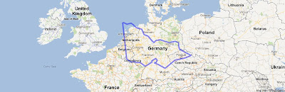
| Heidelberg West Urban Design Framework. (Source: David Lock Associates). |
It is important to remember that there is no sure-fire way of branding for success. Successful branding is a delicate hybrid of each of the three components described above. One of my favoured ways to start my approach is to ensure that I have a comprehensive understanding of the target audience in order to craft a personalised tone of voice, which is then translated into a specific look and feel of the product. Learn the company branding. This for me creates a tailored product that communicates concisely and directly to the target market and successfully translates our vision through graphics, style of writing and report layout. However it is important to note that this method may not be the best approach to every designer, branding and design are indeed personal and subjective.
 |
| Heidelberg West Urban Design Framework. (Source: David Lock Associates) |
From time to time, consultancies may provide a comprehensive graphics template and palette that is usually strictly followed by its designers. In other cases, a freer look and feel can be pursued, or should be pursued out of necessity (one example may be a project that is of different nature and type compared to other standard long-standing ones previously done by the company). Such cases call for a good understanding of the company branding as a whole and how it can be interpreted in the simplest elements of lines and shapes. It can be considered crucial that that the consultancy should take into account these three branding elements and provide their unique direction and approaches in applying them effectively. If such guidance is not available, a branding exercise should be pursued to avoid conflicts and confusion among the designers.
From experience, a good understanding of visual branding and its application in urban design has proven to be a prosperous gateway into creating successful urban design outputs. It allows me to contribute to the graphic repertoire and visual character of DLA whilst also maintaining its established brand and unique identity. In that respect, what are your visual branding experiences in urban design?
From experience, a good understanding of visual branding and its application in urban design has proven to be a prosperous gateway into creating successful urban design outputs. It allows me to contribute to the graphic repertoire and visual character of DLA whilst also maintaining its established brand and unique identity. In that respect, what are your visual branding experiences in urban design?

Great post! Probably the first post I have come across which is dedicated for UD report graphics!
ReplyDeleteIn my opinion, the market position does not matter. It is the scale of the project and budget are the two criteria that determine the report/graphics output.
Thanks for a different amazing publish. Led Lights Sydney, Led lighting Sydney
ReplyDeleteHowdy Guys
ReplyDeleteIf you are in searching of Legit vendor for Fullz you are at right place
Just try my stuff you'll never be disappointed
Although, I'm giving replacement for the bad stuff as well
USA UK CANADA Fresh Fullz Info Pros Leads Available
All States & Cities info are available
Young Age, Old age, Mid age,, Every age you can asked
Real DL scan with selfie proof available
Fullz Pros with dl issue & Expiry dates available as well
Each & Every type of Fullz Pros Leads of USA UK CANADA you can get from my shop
Samples are also available for bulk buyers & for testing
No scam, will show you proof of everything as well
Contact me for the best deals & discounts
24/7 available for you
What's App - +1.. 7277.. 886.. 129..
Tele - @ leadsupplier & @ killhacks
Skype - @ peeterhacks
E mail - cyber.zoneuniverse at g mail . com
Fresh Spammed available in Thousands & Millions
Stuff will be provided within 10 mins after payment proof
Guarantee for the stuff Info & Validity
USA SSN DOB DL ADDRESS EMPLOYEE & BANK INFO FULLZ LEADS
UK NIN DOB DL ADDRESS SORT CODE ACCOUNT NUMBER FULLZ
CANADA SIN DOB DL MMN PHONE EMAIL FULLZ
DL SCAN ORIGINAL FRONT & BACK WITH SELFIE
BUSINESS EIN COMPANY FULLZ
OLD & YOUNG AGE PROS
STUDENTS PROS IN BULK
HIGH CREDIT SC PROS FULLZ 700+
FULLZ WITH SSN DL MVR
DL FULLZ WITH ISSUE & EXP DATES
EMAIL & PHONE NUMBER & BANK INFO LEADS USA UK CANADA
CC WITH CVV & DUMPS WITH PINS
CARDING & CASH OUT METHODS WITH TUTORIALS
SPAM-MMING TUTORIALS WITH TOOLS & LEADS
OFFICE365 LEADS & LOGINS
Quantity with Quality stuff available
Payment only in Crypto & Cash app